Typography
Graphic Designers make exensive use of specific Typefaces when designing graphic solutions. A Typeface refers to a specific 'family' of type. In more recent times the word Font has often used to mean the same thing.
Typography is concerned with the techniques for chosing and arranging Type to visually communicate with the intended audience.
Consider the iconic Logos below. Each Logo uses a very specific Type. The Type itself is a combination of a Font Style, Colour, Size, Alignment and Positioning. These are all key elements in effectively using Type in your designs.
Typefaces are often combined with simple graphics to produce a Logo that is easy to remember and simple to reproduce at different sizes (for the web, letterheads, on products etc). Consider the Logos below:
Logo Design is not just about making the words legible. The choice of Typeface and how it combines with the layout, grid, colour scheme, design theme and so on will make the difference between a good, bad and great design.
Typography Basics
Family |
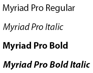
Fonts exist in 'families' meaning that there are different versions available. |
 |
Style |
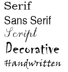
Common Type Styles are Serif, Sans Serif, Script, Decorative and Handwritten |
 |
Serif |
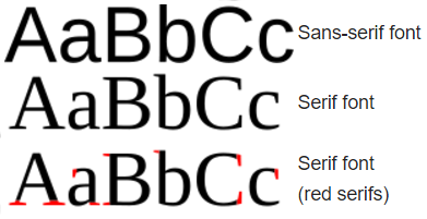
A serif is a small line attached to the end of a stroke in a letter or symbol. A typeface with serifs is called a serif typeface. A typeface without serifs is called sans serif. |
 |
Lines |
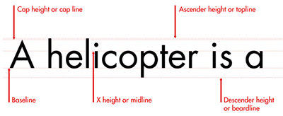
A line of characters has at least five lines that it can be aligned to. These horizontal lines are guides for capital letters, ascenders, lowercase and descenders |
 |
Leading |
describes the amount of space between lines of text. |
 |
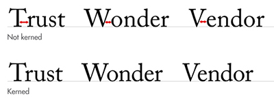
Kerning |
describes the amount of space between two characters. |
 |
|
